The Design Team
Brielle Bush
Louisa Chen
Drew Grimstead
Nathan Limono
Jonathan Trinh
Problem Context
Problem Statement
Sustainable Development Goal
SDG 12: Responsible Consumption and Production
What is E-Dubs?
E-Dubs is a smartphone application that addressed the shortage of easily accessible resources for the University of Washington students to dispose of their electronics by providing pick-up services and guidance to nearby recycling centers. This project was a case study in which we focused on the sustainable development goal of “Responsible Consumption and Production” and developed a prototype that shared our team’s interest in sustainability and preserving the health of the earth. I established how I unknowingly encounter a bin designed for only electronic recycling, which I did not even know existed. We all agreed that a majority of people may not know about electronic recycling and that the topic fits well with our group’s interest in helping reduce waste and supporting good sustainability practices in which related to our choice of SDG 12: Responsible Consumption and Production
With the idea of electronic recycling as our guide, our group dove into some initial research about e-waste (electronic waste) and the current issues regards to electronic recycling and sustainability. We found that:
Electronic recycling and e-waste management are vital environmental issues needing more awareness and action.
Improper e-waste disposal harms the environment, contaminating soil and water with hazardous materials.
Recycling e-waste conserves resources and reduces the ecological footprint of electronic devices
The rapid growth of electronic waste poses hurdles in implementing efficient recycling methods.
Awareness campaigns, education, and EPR schemes can promote responsible behavior and sustainable product design.
These insights allowed us to further understand these issues and to develop the following problem statement
How might we inform University of Washington students about electronic recycling options around campus to reduce waste?
Research
From our problem statement, our group primarily engaged in user research to obtain insight and understand how we can help solve the problem that we are facing. We enagged in user surveys and users interviews.
User Research: User Surveys
Our survey was disseminated to the University of Washington student body and we received 42 responses. From those responses, we found that…
69% of respondents were unaware of existing electronic recycling apps or services
71.4% of respondents had never recycled their elecontircis
Over 90% of respondents indicated they would be motivated to recycle their electronics if given an incentive
From this information, 2 main insights became very apparent:
Lack of knowledge and practice for electronic recycling among UW students
Apparent need for accessible and convenient electronic recycling opportunities
User Research: Expert Interviews
For our user interviews, we reached out to employees of local company’s that specialize din electronic recycling and support the concept of sustainability and recycling. Below are the individuals who lead or coordinate their organization and the main insight that we obtained from our interviews with them.
Audrey Taber, Program Coordinator & Interim Manager at UW Recycling
No system in place to collect large electronic items
Need for an application/tool that shows recycling locations
Few/none existing pickup program
Daniel, Owner of Seattle Computer Recycling
Lack of company exposure
Need for a platform to advertise services
More awareness of available companies
Eric Wahl, Program Coordinator at UW Surplus
Lack of awareness of recycling programs
Laziness and ignorance among society
Lack of alternative ways to recycle
User Cases
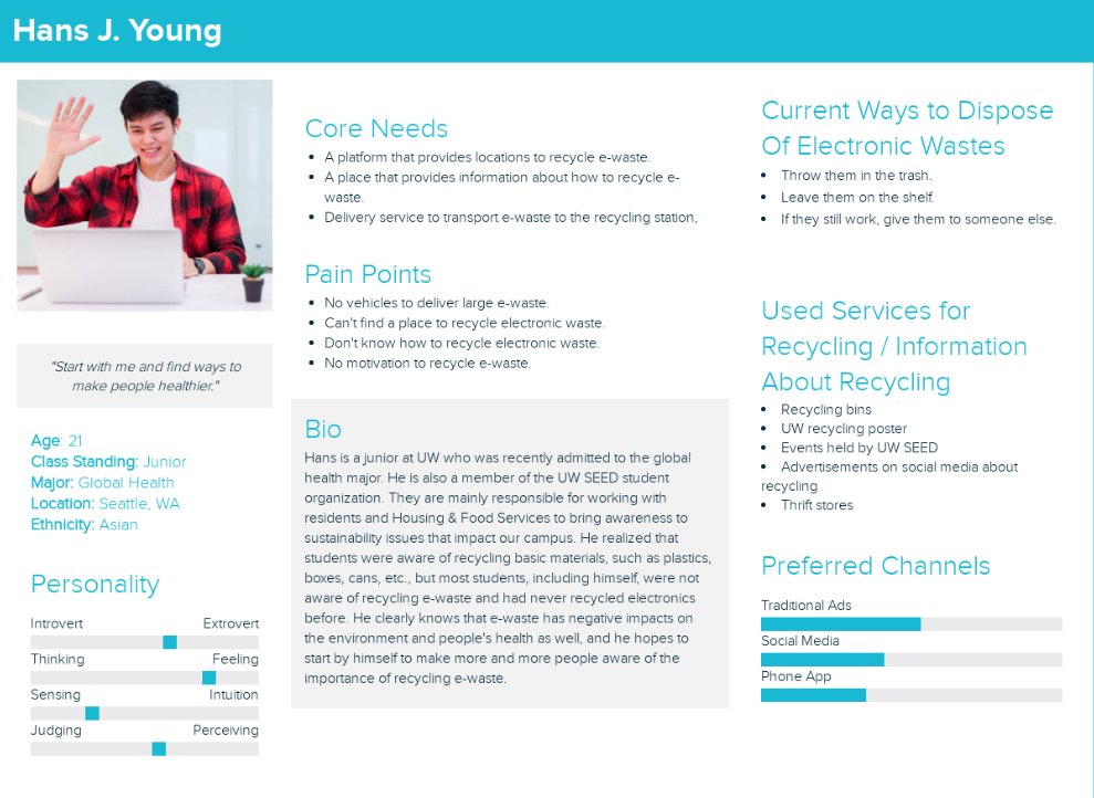
From our user research we develop user cases to better understand our primary users for our tool and how the features of our product can help them.
From our research and user personas, we were able to ideate and developed a foundation towards what our prototype should accomplish. We then dicussed and agreed on a set of primary features within our ideation phase.
Ideation
During the project’s ideation phase, we developed a specific set of P0 features that will be the main features within our application. These features include:
Map
Pick Up System
Reward System
We chose these as our foundational features within our product because we believe that these features would be essential for enabling easier accessibility to electronic recycling resources and encouraging individuals to practice electronic recycling. The map would enable users to find nearby electronic recycling centers and buildings. They would also have access to a search feature on the map that allows them to filter locations based on items they want to recycle. In our application and our ideal service, we would also provide a pick-up service, where users can input a location to have our organization pick up their unwanted items to be recycled. Within our application, users can get rewards points/tokens based on the number of items they recycled through our application. Users can then utilize those points and trade them in to obtain gift cards from organizations, such as Starbucks or BestBuy. With these features in mind, we started developing our iteration of prototypes.
Iterations
Iteration 1:
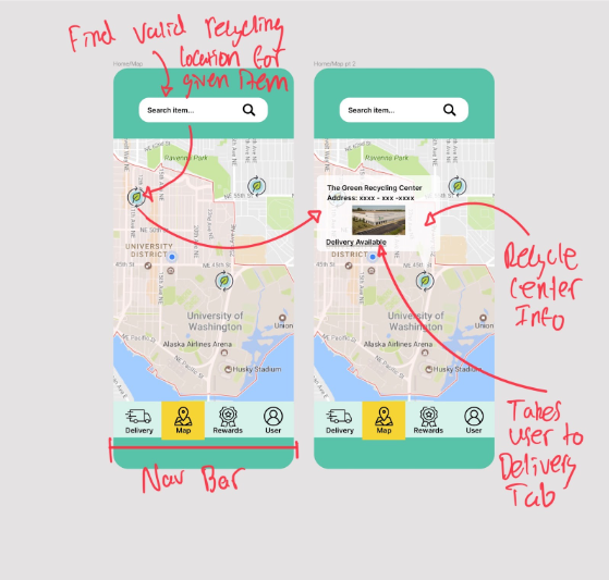
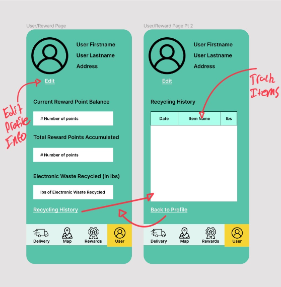
In this first iteration, my team and I drafted a basic outline on Figma to lay out the functionality of the application, annotating the wireframes to highlight key screenshots of the project. Below are the annotated wireframes. all these wireframes feature a navigation bar that will allow users to access our key features easily.
The first (top right) screenshot contains our map feature, where users can see nearby recycling centers and their information. Users can utilize the search bar to find valid locations that can accept the items that users want to recycle. The second (top left) screenshot contains our delivery/pick-up feature. We designed this feature in order to enable easy pick-up of users’ recyclable items if users are too far away from their nearest recycling center. Users will find a location that can recycle their items that our organization's pick-up driver will go to drop off the items. Then users will fill out information regarding their items and will see how many points they will receive for their recyclable items. The third (bottom left) screenshot shows the reward system feature, allowing users to trade in their collected points for different rewards like Starbucks gift cards. Lastly, the fourth (bottom right) screen features a user profile feature, where they can check on information related to their account such as recycling history and how many points they have collected in their account.
Iteration 2:
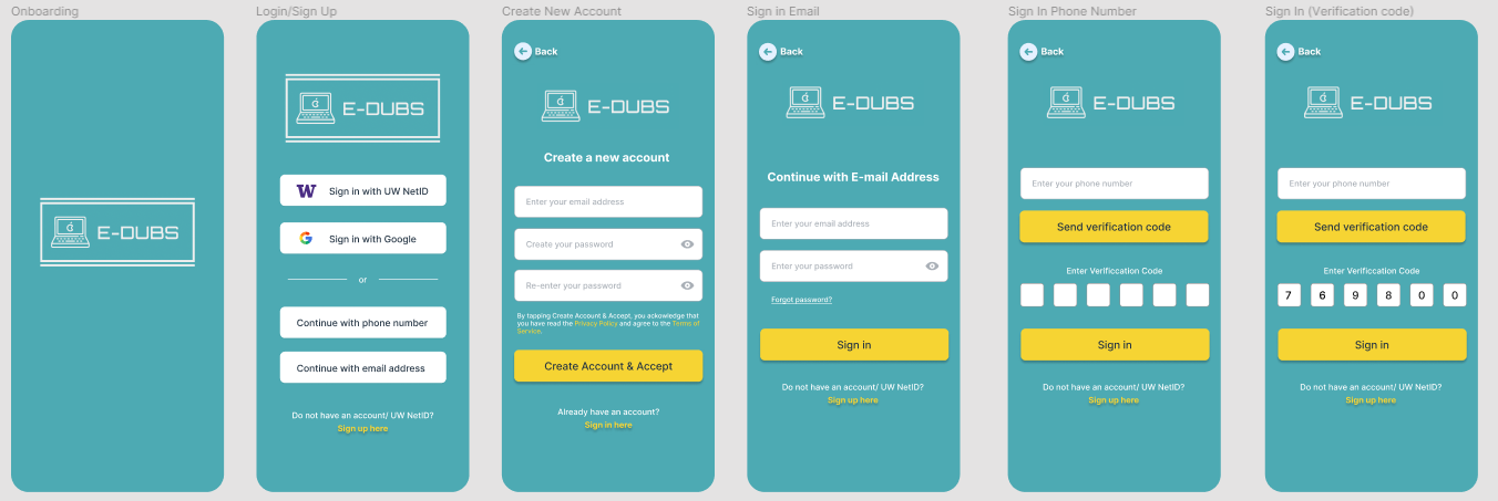
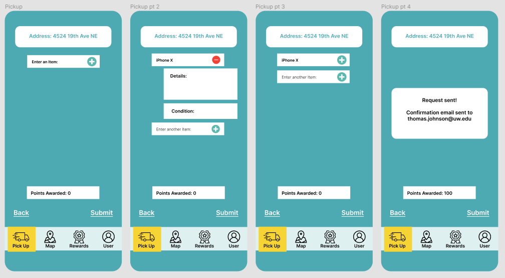
In this second iteration, my team focused on developing a researchable prototype, creating all the wireframes users would ideally encounter within our application's average user journey.
Users would initially login into their account. Our user log-in page was designed so that University of Washington students can log in easily using their UW student NetID.
After logging in, users will be taken to the home map page, where they can search and see nearby locations where they can recycle at.
From the map page or when users tape off the “Pick Up “icon on the navigation bar users can utilize the applications pick-up feature where they can request for their items to be pick-up and recycle for them and where they can earn points for their recycling.
After recycling and obtaining points, users could travel to the rewards shop page and engage in the points reward trading process. Users would select the rewards they want and how many of each. Lastly, they would arrive at a page about whether they are ready to confirm their purchase and then end up on a confirmation page about their completed purchase.
After competing some user research with our prototype, it appears that our design was a success. All of our users were able to complete the intended user flows without help from the test administrator. Most feedback we received was about making things more intuitive for a first time user, such as having a descriptive text field instead of a plain search bar.
Reflection
By the end of the class, my team and I felt our design was an overall success. We felt we were able to accomplish a design cohesively as a team and were able to communicate each of our goals for the project. However, we did collectively realize some of the flaws within our design. For example, our pick-up feature only enables users to send a request, and pick-up drivers would call users when they can pick it up. In our pick-up feature, we wished we could have implemented a scheduled pick-up time component, allowing users to set up a pick-up time to enable a more efficient way for users to have their items to be picked up. In addition, most of the users of our application are UW students. Students are busy during daytime hours on weekdays and may have class schedules and exams. Therefore, most of the students have available time primarily on weekday evenings and weekends. However, the most common full-time work schedule is a variant of 9:00 AM to 5:00 PM, Monday through Friday, meaning less availability for drivers and users to exchange items at an efficient and comfortable pace.
This project educated me and the rest of my team about having to think more deeply about the user journey and be more perspective about the flaws within our design. We need to consider every step of the user journey more carefully in order to build a impactful and practical products in order for them to be effective and meet the goals of the project.

